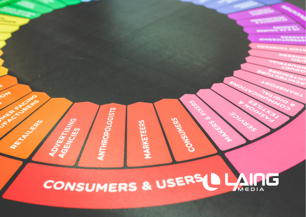
Whether you’re designing a new website or upgrading your old one, colors play an important role in the overall aesthetics of your site. Aesthetics are not just about appearance but also how users feel when they interact with your site. It’s not just about what colors you use, but how and where you use them that makes all the difference. Colors have the ability to influence user behavior, which is why it’s essential to know how different hues can impact your website and its visitors at first glance.
Whether you want to emphasize certain areas of your site or just want to add some visual interest, this guide will help you understand how colors impact your user experience and give examples of where and how different colors can be implemented in your unique situation.
Define Your Goal Before You Start.
Before you start choosing colors for your site, it’s important to define what you want to accomplish with them. Color is a powerful tool that can be used for many different reasons. First and foremost, you want to ensure your colors are consistent with your brand. In many cases, the colors you use will be dictated by your brand guidelines, but it’s still important to make sure each hue complements your overall message and is used in a way that contributes to the user experience.
Additionally, you want to make sure your site is eye-catching and catches the attention of potential customers while also making it easy to navigate. Depending on the demographics of your desired audience, certain colors can help you achieve these goals.
Why is Color so Important?
The human eye is naturally attracted to certain colors, especially when they’re used as a background. This can help you create visual interest and direct attention to the most important areas of your site. For example, using a bright, eye-catching color in the background can draw attention to the call-to-action button on your homepage, which is essentially the one thing you want your users to focus on first when visiting your site.
You can also use color to add visual interest to a page that is otherwise lacking in aesthetics. However, choosing the wrong color can have a negative impact on your site if it doesn’t complement the overall aesthetics, and therefore, your brand’s image.
Which Website Color Is the Most Important?
No color is more important than the other, but certain colors can have a bigger impact on your website than others, depending on the situation. Again, this is largely dictated by your brand guidelines, but there are instances where certain colors can be used to stand out more on your site. For example, if you want to create visual interest on your homepage, you can use a bold color, like orange, to create bursts of color that stand out from the page.
Orange is also great for increasing attention, which is why you often see it used on roadside signs. Orange is also a great color for drawing attention to call-to-action buttons on the homepage and in the navigation. However, if orange doesn’t align with your brand, you don’t have to completely avoid it. Instead, you can use a very light or muted shade of orange to create the same visual interest while still maintaining the integrity of your website’s aesthetics.
What Color Should You Use for the Background?
While there are many different colors you can use for the background of your site, a few emerge as favorites. While black is a popular option, especially for e-commerce sites, it’s important to remember that it is typically associated with seriousness and formality. This can work well if your site is focused on business and finance, but it’s not the best choice for more informal or creative sites. Contrasting colors, like blue and orange, are often used together to create a vibrant color palette that is both interesting to look at and eye-catching. However, these combinations can be difficult to pull off in a way that doesn’t seem garish or out of place.
Keep in mind that warm colors, like orange and yellow, tend to draw the eye towards the top of the page, while cooler colors, like blue and violet, catch the eyes at the bottom. This is why many designers use a warm background with a cooler secondary color for the text and call-to-action buttons.
What About Header and Text Color?
As discussed earlier, warm colors tend to draw the eye to the top of the page, making them ideal for the header. Blue is also a popular choice for headers because it can be used to create a sense of trustworthiness and security.
Blue is also a great color to use for the text on your site because it allows the reader to focus on the words without being distracted by other colors on the page. Blue can also be used to create a sense of authority, which can help legitimize your business.
How to Choose the Right Tint and Shade of a Color?
If you want to use a specific color for one of the elements on your site, such as the header or text color, it’s important to know the difference between a tint and a shade of a color. A tint is when you add white to a color. A shade is when you add black. While the two are similar, they have very different connotations.
A tint is more subtle and is best used for body text. A shade, on the other hand, is bolder and more attention-grabbing. Given that colors can have different connotations, making sure the tint or shade you choose is consistent with your overall message is important.
Which is the Best Color for Call-to-Action Buttons?
You can use several colors for call-to-action buttons on your site, including red, yellow, and orange, and each hue can provide a different type of emotional response.
Orange is one of the most attention-grabbing colors and is often used for road signs since it’s so eye-catching. However, this can sometimes come across as aggressive, especially if it’s paired with a high-converting, competitive price. Orange is a great color to use if you’re trying to catch the eye of your audience and get them to convert on a very specific offer.
Red is often used to inspire passion and excitement, making it a great color for discount offers. However, red can be viewed as aggressive and can come across as negative if not used correctly. This color is great for discounts and sales, but it’s not ideal if you want to inspire trust or authority.
Choosing a Creative Web Design Team
When it comes to designing a website, it’s important to remember that every little detail counts. This includes the colors you use throughout the site, which can significantly impact your user experience.
When choosing your website colors, make sure you’ve considered your brand and how different hues can impact your users. Once you’ve figured out your color palette, be sure to apply those colors throughout your site to compliment your overall aesthetics and provide your users with a great user experience.
If you don’t already have a design team available to help you work through the right colors for your website, consider working with an agency like Laing Media. Having a team of experienced designers can make the process of choosing colors for your website a lot easier. For more information, visit https://laingmedia.com.


