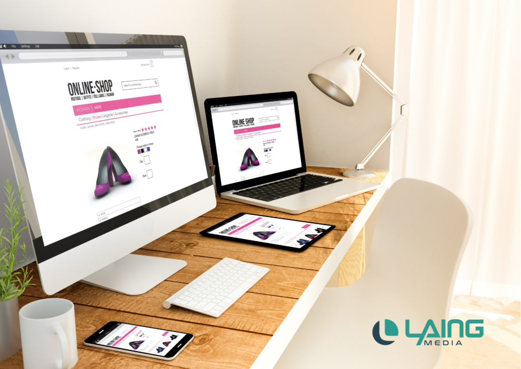
First impressions are everything. When we go on a first date, we carefully consider what we wear and how we look to ensure that our potential partner thinks the best of us. When getting ready for an interview, it is important to look clean and polished so that your future employer knows that you are put together. The same thing goes for your business storefront. For many, that storefront is your website.
A business website is no longer a luxury for business owners, but a necessity. Often, your website is the first stop where a potential customer will see when learning about your brand, products, or services. In fact, recent research shows that users make a decision about your business website in the first 0.05 seconds (that is 50 milliseconds!). That is a very short amount of time to make a positive first impression. Adding more pressure, 94% of that decision is based on design.
Although there are several important elements that make up a great website, two factors should be considered when organizing your final layout: fonts and spacing.
How Fonts Impact the User Experience
Fonts are typically considered during the initial brand design process. Selecting fonts is part of finding your external expression for your brand. However, the fonts that you use for your branding materials may not be the fonts that you want to use on your website.
For example, if your brand fonts include elaborate calligraphy or funky lettering it would not be wise to use this throughout your website copy. Calligraphy text or funky fonts can be illegible with denser paragraphs. While they may be perfect for your logo and other brand materials when selecting a font for your website you want to look for something that is more clear and legible. Readability will determine your user experience (UX) and can either keep users on your website or turn them away.
Psychological Impacts of Fonts
More importantly, fonts have the power to trigger certain psychological responses from the users. Certain fonts can create a sense of trust, reliability, fun, or even sophistication.
While there are thousands of fonts out there to choose from, there are usually four main types of fonts to consider.
- Serif: A clean and simple font that is more traditional.
- Sans Serif: A modern version of the previous simple font style.
- Handwritten: A creative and personal style of font.
- Modern: A font that is progressive and futuristic, but can still be clean.
- Display: A creative and design-focused font that is typically reserved for headings.

Another thing to consider about fonts is whether they are web-friendly. Web-friendly fonts are easily uploaded to various platforms and devices, allowing for faster upload speeds and avoids anything literally being lost in translation when opening the web page. When selecting a font for your website, consider fonts that complement your brand but are also legible and easily found on multiple devices.
How Much Space Is Too Much Space?
One of the most important elements of web design is spacing. Web designers learn early on the importance of utilizing white space and managing paragraph and line spacing across the website. But how much space is too much space?
While white space may make some people uncomfortable, designers know there are many benefits from utilizing space across the website. Much like the psychological impacts of fonts, space can create visual cues for users.
The law of proximity is the idea that the human eye creates relationships between certain visual elements. This means that certain elements that are spaced closely together may seem related, and those that are spaced far apart may be deemed unrelated. This also works with website copy. When texts are spaced closer to the heading, it becomes clearer to the reader that this particular section belongs together.
Using Space Effectively
Space can also be used to create feelings through your web design. More white space often eludes to luxury and sophistication, where less space may create more movement and fun.
Another important area that space can improve on is with the fonts and text. From surrounding spaces to line spacing, the selection of your spacing can impact legibility. You want to make sure that the line spacing is far enough so that your text isn’t jumbled, but also close enough so to avoid it being illegible or disorienting. In fact, utilizing white space correctly can increase readibility by 20%.
Also, it is important to note that white space doesn’t have to be white. You can fill up that blank white space with colored backgrounds to create the illusion of more activity happening on your page.
Designing Websites With Impact
Whether you are working towards a brand refresh or building your business from the start, your website is the first place that all of your branding visuals and messages come together. To ensure that you are creating a good user experience be thoughtful of the fonts and spacing you use in your website. Make sure that they align with your overall brand while also creating a positive user experience.
Consider working with a team of professional web designers that understand the balance between fonts and spacing for your website. Laing Media is equipped to bring your website into the future, whether giving your existing site a facelift or building you a new one from scratch. Visit https://www.laingmedia.com for more information.

Beyond ChatGPT: Exploring the Top Competitors in the Conversational AI Space
ChatGPT has emerged as a frontrunner in conversational AI, captivating users with its natural language processing capabilities. However, the competition in this space is fierce, with several other players vying for the top spot. Because of the buzz surrounding AI, we...
From Viral Videos to Brand Success: How to Master Marketing and Advertising on TikTok
Are you ready to tap into the power of TikTok and take your brand's marketing and advertising to new heights? Viral videos have become the currency of success, and TikTok has emerged as the ultimate platform for capturing the attention of millions. With its addictive...
An Easy Introduction to Facebook Advertising
Facebook advertising is not anything new, but since launching, it has emerged as a powerful tool for businesses to reach their target audience and boost brand visibility. As a social media platform with billions of active users, Facebook offers a diverse range of...
Talk to an expert.
For more information on web design and Laing Media’s web development services:

Lamar Laing
Senior Web Developer
e: sales@laingmedia.com
p: (770) 696-6583


