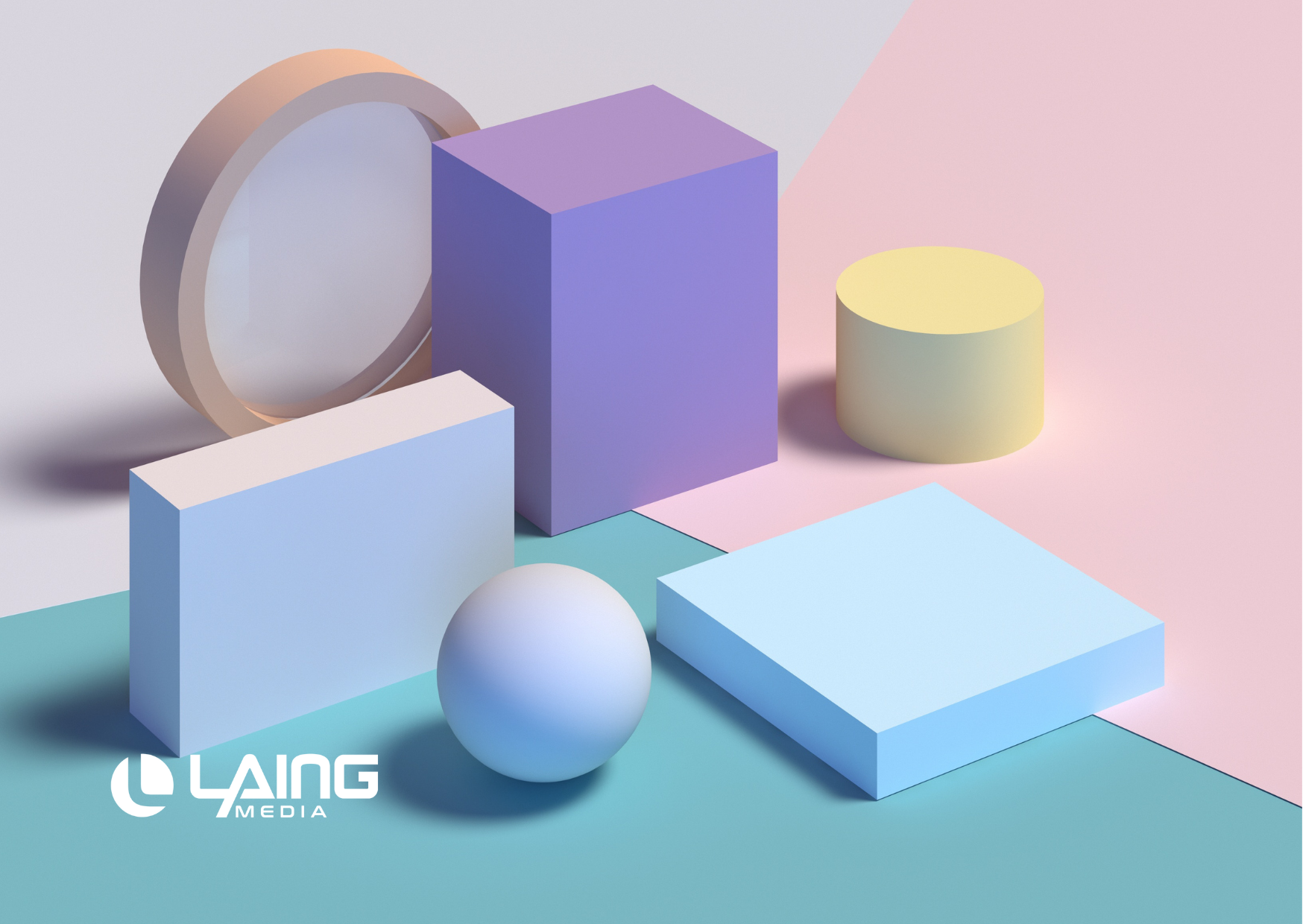
It’s a well-known fact that web design is an art—and so, it stands to reason that the principles of art also play a role in shaping how websites look. Every element of a website has some kind of function, but geometric shapes are one of those elements that can lend visual appeal to your brand. So why exactly are geometric shapes important for your brand’s website?
Shapes can be used to make the visitor focus on specific elements, associate the content with topics from their previous experiences, or simply make everything more beautiful. We’ll be exploring geometric shapes in web design and why they are so important when creating a brand website. The tips in this article will help you create an aesthetically pleasing site that is also easy for users to navigate.
There are 12 common geometric shapes, each of which comes with its own set of visual properties. Some are used more often than others. When you use these shapes to design your website, you are able to convey certain messages to your visitors with relative ease. As you work your way through the shapes, think about the website you’re designing. What purpose does the website serve? What does your brand stand for? These are the questions you need to ask yourself in order to decide which geometric shapes to incorporate into your design.
Why are geometric shapes important in web design?
Like we just mentioned, geometric shapes are often used in web design to communicate a message to visitors. These shapes can be used in a wide variety of ways, from the colour scheme to the images you choose to include on your site. For example, say you were designing a website for a financial advisor. You want to communicate the idea of trustworthiness, reliability, and dependability through your website design.
One way you could do this is through the use of geometric shapes. You could incorporate a lot of squares and rectangles into your design, as these shapes are often associated with stability and dependability. If you want to create an aesthetically pleasing design, you could incorporate a lot of circles, ovals, and other shapes that are visually appealing. Or, if you want to create a design that is futuristic and edgy, you could incorporate triangles and hexagons into your design. Just be sure to stay away from geometric shapes that are too bold or complex. You don’t want to create a chaotic design by incorporating too many geometric shapes.
Geometric shapes can be used to communicate a variety of different messages. You just need to think about the brand you’re trying to create and what message you want to send to visitors.
Rectangle
Let’s start with one of the most common geometric shapes: the rectangle. And, just like the other geometric shapes discussed in this article, rectangles have their own set of visual properties. If you’re designing a website for a financial advisor, a rectangle is an excellent geometric shape to incorporate into your design. It is often used to communicate reliability and stability, which are two things that financial advisors need to cultivate in their clients.
Square
Next up is the square. A square is a two-dimensional shape that has four 90-degree angles. It creates a visual representation of symmetry. When choosing geometric shapes for your website, you could incorporate a lot of squares if you are designing a site for a home decor or fashion brand. This geometric shape is often associated with edginess and creativity, which are two traits that home decor and fashion brands must have.
Circle
Next up is the circle, which is a two-dimensional shape that has been formed by a single line that has been rotated 360-degrees. A circle is a round shape that has no sides or corners. Circles are an excellent geometric shape for designing websites for healthcare companies. This geometric shape is often associated with healing and wellness, which are feelings that healthcare companies want to evoke in their clients. They can also evoke feelings of unity and protection, making customers feel safe to develop trust with the brand in front of them.
Triangle
Now let’s look at the triangle. This is a three-sided shape formed by lines that intersect at a single point. If you want to create an aesthetically pleasing design, triangles are a great geometric shape to incorporate. This geometric shape is often associated with creativity and uniqueness, which are two traits that can help your brand stand out from the competition. It can represent balance, and also be used as a visual aid to guide the user’s attention to a specific point.
Hexagons
For those looking to really stand out, you can opt for more complex shapes like the Hexagon. This six-sided symmetrical shape can help create depth in your web design. Since hexagons are commonly found in nature, this shape is great for science-related brands or conservation websites. It is also a great shape for web designs that aim for a futuristic look. Combined with bright colors, the hexagon can be used to take your website into the future.
The Future of Web Design
Geometric shapes are often used in web design to communicate a message to visitors. When you use geometric shapes in your design, you are able to convey certain messages to your visitors with relative ease. Now that you know what geometric shapes are and how they can be used in web design, it’s time to put this information into practice.
If you’re looking to work with a web design professional to guide you through selecting the right geometric shapes for your website, visit https://laingmedia.com to talk to a web design specialist.
How Colors Impact Your Website: A Complete Guide to Get You Started
Whether you’re designing a new website or upgrading your old one, colors play an important role in the overall aesthetics of your site. Aesthetics are not just about appearance but also how users feel when they interact with your site. It’s not just about what colors you use, but how and where you use them that makes all the difference. Colors have the ability to influence user behavior, which is why it’s essential to know how different hues can impact your website and its visitors at first glance.
How to Redesign Your Website Like a Pro: 5 Tips for a Successful Re-Launch
Do you remember your old school website? Probably not. Most brands cringe when talking about their original websites, which mostly looked like a Geocities page. However, things have changed now. Users are more demanding and expect more from brand sites. They are...
9 SEO Tips to Make Your SaaS Company More Appealing to Customers
Creating a successful SaaS company can feel like an uphill battle. With so many software solutions available, it’s difficult for new services to break through and capture the attention of potential clients. Even some of the most established SaaS companies struggle to...
Talk to an expert.
For more information on holiday season content and Laing Media’s digital marketing services.


